What Makes a Typeface "Good" Part 01
Choosing The Right Typeface
As a graphic designer you know the most crucial decision of any design is font selection. A typeface can totally change the look feel and meaning of a design. And we all know there are good typefaces and bad typefaces. When you see a well designed typeface something just Feels right about it even if you can’t quite put your finger on it. But when it comes to choosing typefaces that feeling might be more elusive. If type is such a crucial piece of the puzzle the ability to pick out a well designed typeface from a see of average is one of the most valuable skill you can have as a graphic designer.
Just to introduce myself before we get too far. I am a graphic designer and a typeface designer I have seen behind the curtain and want to give you my take on the issue. This post aims to give designers the ability to pinpoint and the language to articulate what makes a typeface “good”
Now, there are all kinds of different typefaces, serif, sans, blackletter, monospaced scripts etc.. and each one may be appropriate for a different occasion. Just to clarify this isn’t about what make a typeface appropriate. That is a whole other issue. This is about what do all well designed typefaces have in common no matter the style. And how you as a designer can identify them.
There are 3 things all well designed typeface have in common. This is just part one so we will only address the first box to check and leave the other two for parts two and three. Without Further ado, I give you Curve Harmonization.
Harmonious Curves
Harmonious curves is the number one thing that gives the feeling of “rightness” to a well designed typeface. That “Can’tQuiteArticulateItButItJustLooksGood-ness” of a font. So what exacly does “harmonious curves mean? Let’s get real wonky for a second I think you can handle it (afterall you are reading a typeface design blog.)
Drawing Tools
When it comes to creating digital typefaces the method of drawing is via outlines. This differs from traditional letter drawing in the physical world where the stroke of a letter is described all in one fluid motion. Think of how you might draw the letter “A” with a pencil, pen, crayon, a fat marker, or a paintbrush. The letters may end up looking very different but you draw them the same way a stroke up, a stroke down, and a stroke across the middle. That gives you the letter. With a pencil, pen, crayon marker or paintbrush all being different tools the same motion gives you different results.
In digital letter drawing there really is only one tool the outline. So instead of creating the stroke and the fill all at once in an intuitive stroke digitally drawing of letters is a much more meticulous process take the most simple letter there is a capital I just one line. If you draw it with a physical tool you just draw one line and the tool gives it the personality. When it comes to digital drawing you cannot simply use your mouse to draw one line and expect personality you must draw the topo of the I then the left side, then the bottom, then the right side. And when those outlines all connect they are filled in and create a stroke. ( as a note many design softwares refer to the outline of a shape as a stroke. Here we will call it an outline and stroke refers to the gestural lines of letters.)
The basic “tools” for digital drawing are not pencils and brushes but nodes and handles. Nodes are points on a curve and handles are points connected to nodes that give designers the ability to manipulate curves between nodes. If you are familiar with adobe illustrator or any other vector drawing software you should be familiar with the process of using nodes and handles to draw outlines.
Defining Harmony
Now if you are following so far this hold on things are about to go beyond the territory of the graphic designers knowledge and cross into the hyper wonky realm of typeface design. Now that we understand how digital typefaces are drawn. We can dive into the concept of defining harmonious curves.
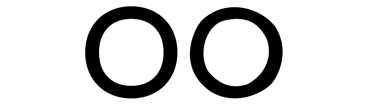
To start off, harmony refers to how “smooth” a curve looks. Check out these two curves. One on the left looks nice and smooth, one on the right looks absolutely hideous. Kinda bumpy and just wrong.
This has to do with the placement and care given to the placement and relationship of nodes and handles. The two ‘O’s below show the nodes and handle placement.
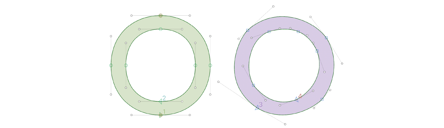
You can see that the O on the left has all the points nicely aligned on veritcal or horizontal plains. All the points have on opposite partner point across the stroke and the handles on either side of each node are the same length. Also the handles on the inner outline describing the negative space of the bowl are longer than those on the other side of the stroke. The result is an extremely harmonious cure. The “O” on the right is a different story. None of these things are true and the cures of that second “O” are decidedly lacking in harmony. (Which is kinda a vibe but we can get to that issue later.)
Now we are about to get into the final boss of wonk so prepare yourself accordingly. Lets talk about the technical levels of harmonization.
G0 G1 G2 G3
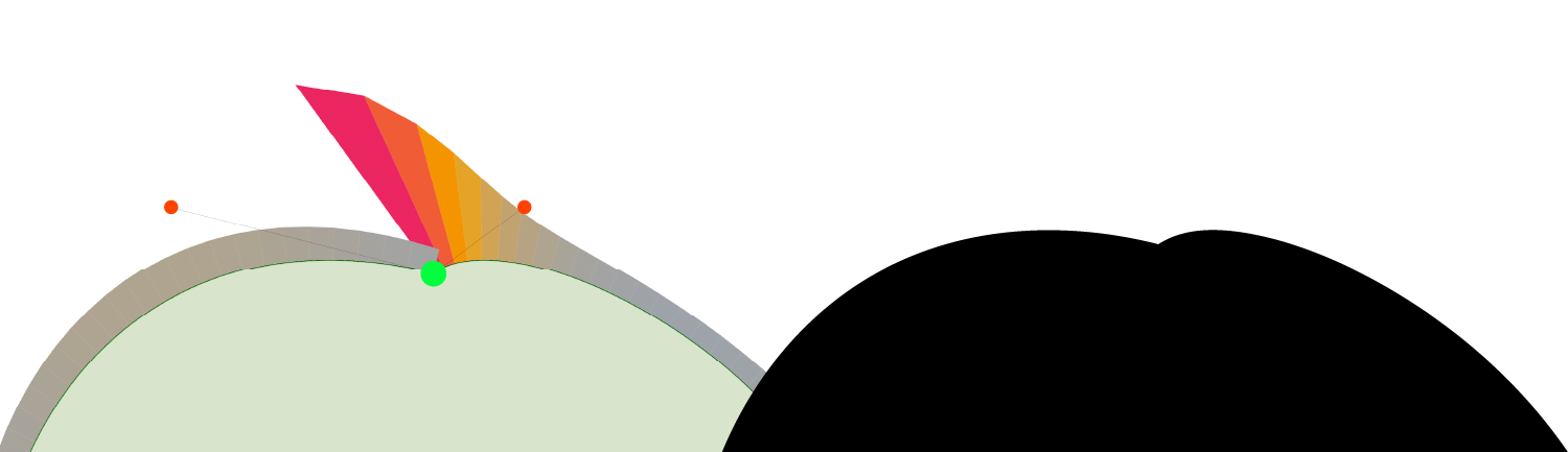
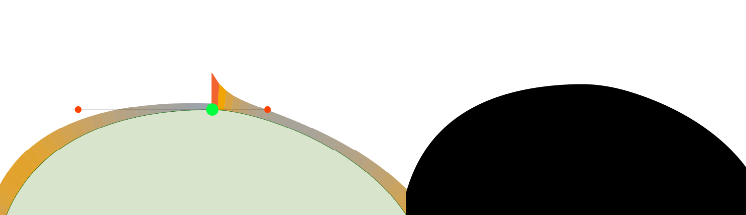
Harmony is not a pass fail thing. It comes in levels. Let me break them down using nodes handles and a tool called “Speed Punk”
Speed Punk is a tool some type designers (myself included) use to analyze curve curves for “speed” and Harmony. As We go through each level of harmonization I will point you to what you need to know about how this tool visually represents harmony.
G0 Harmonization
this is no harmony. the is a node and handles that do not all follow the same line. They are different lengths and the result is an obvious bump and corner. The speedpuck “fins” are overlapping at the node and are a different color and height. This overlap means G0 harmonization
G1 Harmonization
This is a bit more harmonious the node and handles all follow the same line. The “Fins” of the Speed Punk tool do not overlap nor are they disconnected. They are stick to each other. However the height and color are different. The fins “sticking to each other” is a sign of G1 harmonization. G1 is still better than G0 but still not up to the standard of the Snobbiest among us.
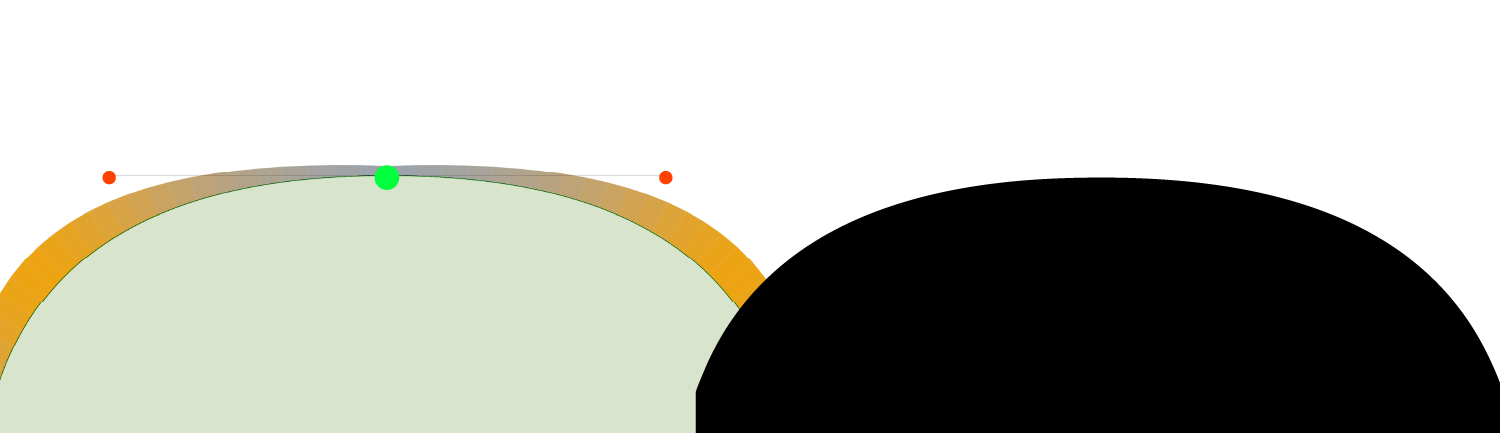
G2 Harmonization
This is the good stuff. The node and handles are all in line. And the handles are placed in such a way that the fins of the speedpunk tool are connected, and the same height and color. Well drawn typefaces should strive to achieve G2 harmonization in their drawings. Sometimes, on very rate occasions sliiiighly off G2 harmonization is passable but 99% of the curves of a well drawn typeface will have G2 harmonization.
G3 Harmonization
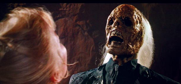
This is the Holy Grail of harmony. However, like in Indiana Jones and the Last Crusade most type designers who dare chase this treasure will end up looking like that dried up skeleton before they ever achieve this feat.
G3 harmony is technically more “smooth” than G2 but is impractical from a technological standpoint and much more time consuming to draw. So while G3 curves are “smoother” they are not better studied for typeface design for 3 major reasons. 1: limitations of technology when it comes to rendering curves (especially in small sizes) 2: the limitation of shapes that can be drawn that have Pure G3 Harmony. 3: pure G3 harmony is kinda boring, a bit of tension leads to more beautiful shapes. Like in music tension and release are also pleasing in the shape of an outline.
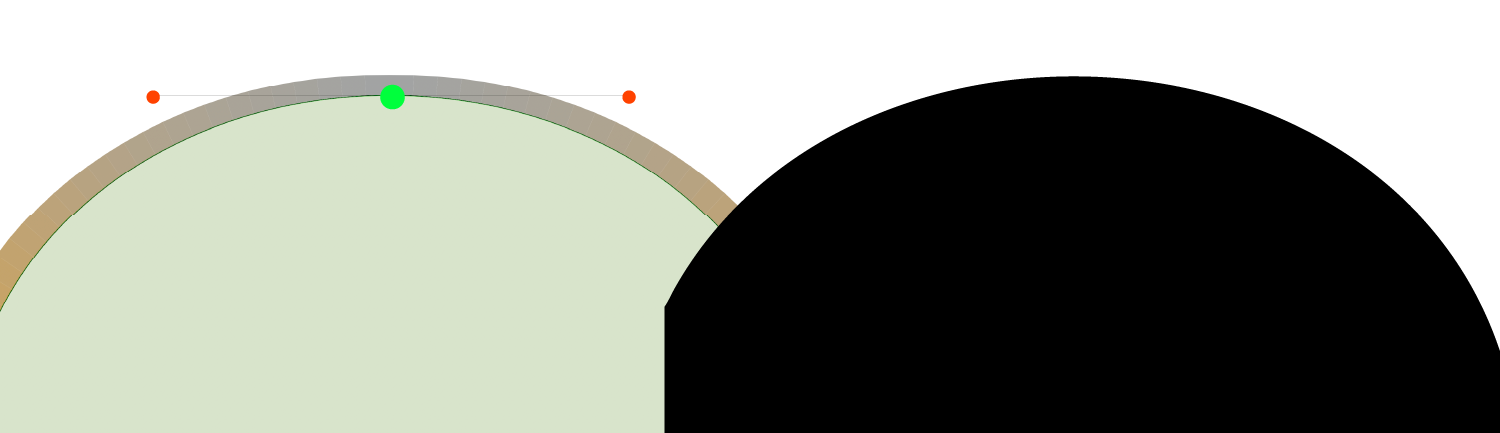
But just so you know G3 harmony is achieved when the fins of Speed Punk are connected, the same height and color as well as smooth and continuous across the entier curve. (no ups and downs)
So What Does This Have To Do With Graphic Designers?
Now lets bring things back down to earth. How can you as a designer recognize a harmonious curve when you see it. Well, The only way I have been able to do so it through practice. Now that you know about the concept of harmony try to spot it when you are looking at typeface. Most of the time it is easy to see harmony (or the lack of harmony) in a minimal sans font but it can be more tricky the more ornate a font gets. Unfortunately stylized display serifs that are all too commonplace are the main victim of lack of harmony. So next time you are choosing between one or the other look at the curves and try to spot bumps and sudden changes of direction. The more you practice this the easier it will become. And with enough practice you too can anoy everyone at parties by commenting on the obvious lack of harmony of all the curved lines that surround you every day. (if you get to this point I am sorry for the fresh hell you now live in.. but only kinda because you probably also draw beautifully well designed typefaces. So they two things balance out.)
PS the unaharmonious vibe from that first “O” on the right is a vibe because it is all tension with very little release. So in the end, like most artistic disciplines, there are no rules, just conventions and tools to communicate. The more deeply you understand them the more powerfully you can wield them.
Thanks for Reading, Now Go Make Something.
Harbor